Posts

Layers and overlays...
Image
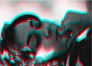
For this project it was vital to use photoshop to experiment with the opacity of the overlay before printing. Even this only helped to a small extent as the thickness of the tracing paper played a big part in the final result. Below you can see some examples of the images...both on their own and also with the overlay included. This is the original image. I initially wanted to create a glitch effect but after  viewing the image with 3D glasses  it appears that the blue and red edging created when making the glitch effect give the image a depth that isn't there without the glasses. This has given us ideas for a sequel to the book. This example shows the image with the overlay of a space helmet included.  It was so black at 100 % opacity that it required some adjustments and test prints before finalising the whole image. This image shows how easily changes can be made to improve the opacity of the overlay.  In this instance I think I lowered it too much. At the end of

Sketchbooking for next years FMP...

Image
Although I am currently working on my book project I have got 1 eye steadily on the future and have decided to start sketch booking ideas ready for next years Final Major Project. I am not entirely sure if I want to base my ideas on an environmentally concerned topic as it is something I have used as a theme throughout my time on this course. I have this grand idea of producing a variety of work from different areas that will show off my digital manipulation skills, almost like a showcase for my digital imaging. I really like this idea but I somehow always get drawn back to my influence being nested in the natural environment and other engaging topics. Below is a pictured guide to how I quickly sketchbooked this idea together. If I were to produce this work for my final major project I would have to take the images myself rather than using Yahoo image search. The concept behind the idea is again environmentally concerned, I want to blend the waste that we discard with the nat

Fonts and Typeface

Image
When creating a book or zine it is important to consider what fonts will be used. It is generally a good idea to stick to 1 or 2 fonts. As with using one image per page I think that using a consistent font is something that helps not only with the visual aesthetics of the book but also the narrative. This is because if the book feels too disjointed the book will not flow well from cover to cover. For our project we have shifted from creating a photo-book to crafting an interactive and thought provoking zine which mainly revolves around the theme of SCI FI. With that in mind I have used appropriate fonts depending on where the images draws inspiration from. The example below is one idea for an image where I think the font and the use of text itself helps with narrative. The concept for the image is based around the idea that the moon landing was fabricated so I thought it would work well if any text included used the actual NASA font. The coordinates included are actually in clos

Looking at book design and layout 1...

Image
For this project we are looking at book design, as part of my initial research for the project I have been looking at my favourite photography books as well as a variety of other 'book' formats. The books below come from 2 of the leading photography organisations...both come in the form of photo-books  which generally tend to be my preferred book to look at. The pages for both are very glossy and the Hasselblad 'Victor' book is huge and covered in a fabric type of material.  Both books are designed in way that says 'we as a company or organisation are prestigious' which works well.  When we look at designing our book we need to choose a style and format that fits the purpose...for example it would be wrong to produce cardboard prints of pin sharp astrophotography images as glossy paper helps to make that type of photography pop off the page. As we are currently bouncing ideas for the narrative and images in the book it is hard to say which route we will ta

Introduction to InDesign...

Image
We have now started to look at Adobe InDesign in preparation for self producing as part of our final module for the year. InDesign, like Photoshop allows a lot of freedom and creativity when creating our own work whilst maintaining an industry standard. Also, there is a lot of information on google and youtube to digest as I get further involved with the project. We first attempted a greeting card type layout following a set of instructions to create the blank document (see below). Although the set up we used was the dimensions of A5 there were certain thing to change to unsure we correctly designed and printed the card. Firstly, we changed added three columns with a 3mm gutter to give ourselves a structured template to work with. This means our work should look neat and professional if we stick to our predetermined work area. Changing the margins to 20mm on all sides keeps this columned area well within the centre of the page we are working on. Setting the bleed to a s

Editing software compatibility...

Image
When opening Photoshop I came across these alerts which pointed to the fact that the program was changing and potentially wouldn't work on my machine. This got me thinking about digital imaging and the software we use. In a digital age where everything is constantly shifting due to technological advancements it is important that we learn the ideas on concepts behind what we do and not necessarily the particular software we are using. In the short time since I have started this course it has been brought to my attention that more and more industry professionals are beginning to use CaptureOne. It got me wondering if I should make the switch to keep up to date even though I have been progressing my work a lot using Adobe software. I don't think I will make the change just yet as I can't see Photoshop ceasing to work with Apple products as this would cause a huge uproar. With the thousands of professional and amateur photographers that have thrown lots of money and time at

Map restoration...

Image
I was asked by a family friend if I could photograph a map for him with very little details on what the job would entail. When I arrived I found the map was made from a banner like material but pre-nylon. The map had also been folded several times and in the creased areas some of the map had worn and also there were area where the colour had changed due to mould starting to form. After realising that this wouldn't be a straight forward job ie simply taking a photograph of it I suggested that, depending on how important the job was that they maybe enquire about specialist scanning of the object. This would potentially be far more accurate. I think as part of professional practise it is sometimes more professional to know when to let the job go. This could take up quite a lot of time and I wouldn't necessarily do the job justice. My friend wasn't willing to go to those lengths with the map and another friend of theirs had said they would retouch to photo once I had tak